How to Make Responsive Tables in Ghost CMS
Tables are a powerful way to present data, but they can be challenging to display effectively on different screen sizes.
As more users access websites from various devices, it's crucial to ensure your tables remain readable and accessible on all platforms. This guide shows you how to make your tables responsive in Ghost CMS, enabling a seamless user experience across desktops, tablets, and mobile devices.
Why Responsive Tables Matter:
Responsive design ensures that your website adapts to different screen sizes and orientations. When it comes to tables, without responsive techniques, users may have to scroll horizontally or zoom in to view the complete table on smaller screens, which is frustrating and detrimental to user experience.
Responsive tables automatically adjust their layout and content to fit the screen size, making the data easily accessible and readable, no matter the device.
Prerequisites:
Before we begin, ensure you have access to your Ghost CMS backend and understand the basics of HTML, CSS, and JavaScript.
Step 1: Understanding the Script:
To create responsive tables, we'll use a simple JavaScript function that wraps each table with a container div. This allows the table to become horizontally scrollable on smaller screens. Here's the JavaScript code:
function responsiveTables() {
  const tables = document.getElementsByTagName('table');
  for (let i = 0; i < tables.length; i++) {
    const table = tables[i];
    // Create the responsive container div
    const container = document.createElement('div');
    container.classList.add('v-table-container');
    table.parentNode.insertBefore(container, table);
    container.appendChild(table);
  }
}

// Call the function to make tables responsive
  responsiveTables();
Step 2: Styling the Responsive Container:
Next, we must add some CSS to style the responsive container and control how the tables behave on various devices. Here's the CSS code:
/* Add styles for the responsive table container */
.v-table-container {
  overflow-x: auto;
  /* Add any other styling as needed */
}
Step 3: Adding the Script to Your Ghost Theme:
Now that we have our JavaScript and CSS ready, let's add the script to your Ghost CMS theme. There are two methods to achieve this.
Method 1: Adding the Script via Ghost Admin Code Injection:
- Log in to your Ghost CMS admin panel.
- Go to the "Setting" and select "Code Injection."
In the "Site Header" section, paste the CSS code provided in Step 2 inside the <style> tags.
<style>
  /* Add styles for the responsive table container */
  .v-table-container {
    overflow-x: auto;
    /* Add any other styling as needed */
  }
</style>
Please add the JavaScript code from Step 1 to the "Site footer" section within the <script> tags.
<script>
  function responsiveTables() {
    const tables = document.getElementsByTagName('table');
    for (let i = 0; i < tables.length; i++) {
      const table = tables[i];
      // Create the responsive container div
      const container = document.createElement('div');
      container.classList.add('v-table-container');
      table.parentNode.insertBefore(container, table);
      container.appendChild(table);
    }
  }

  // Call the function to make tables responsive
  responsiveTables();
</script>
Click on the "Save" button to apply the changes.
Method 2: Adding the Script to Ghost Theme Code:
- Download your theme from ghost admin & unzip it.
- Look for a file called
default.hbs& open that using a code editor such as VsCode. - Please add the JavaScript code from Step 1 before the closing body
</body>tag within the<script>tags. also, make sure it is before the{{ghost_foot}}helper.
<script>
  function responsiveTables() {
    const tables = document.getElementsByTagName('table');
    for (let i = 0; i < tables.length; i++) {
      const table = tables[i];
      // Create the responsive container div
      const container = document.createElement('div');
      container.classList.add('v-table-container');
      table.parentNode.insertBefore(container, table);
      container.appendChild(table);
    }
  }

  // Call the function to make tables responsive
  responsiveTables();
</script>- same way add the CSS codes within the
<head>tag. - Save the file, and zip it up again to reinstall the updated theme.
Step 4: Testing Your Responsive Tables:
Now that you have added the script to your Ghost CMS, it is important to test your responsive tables. To do this, you should preview your website on various devices and screen sizes including desktop, tablet, and mobile to ensure that the tables adapt to each layout accordingly.
If you want to take your Ghost CMS website to the next level, consider using Aether. It comes with built-in support for responsive tables, ensuring a seamless user experience for your readers, no matter how they access your content.
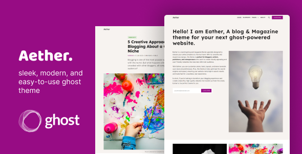
Aether - sleek, modern, and easy-to-use ghost theme
Upgrade your blog or magazine with Aether - a visually stunning and user-friendly ghost theme. Connect with your audience on a deeper level with its adaptable and responsive design. Elevate your online presence today.
Make sure your tables are responsive in Ghost CMS to improve user experience on different devices. Follow the instructions and incorporate JavaScript and CSS into your theme for visually appealing and accessible tables.
Happy coding!